What started this in the first place?
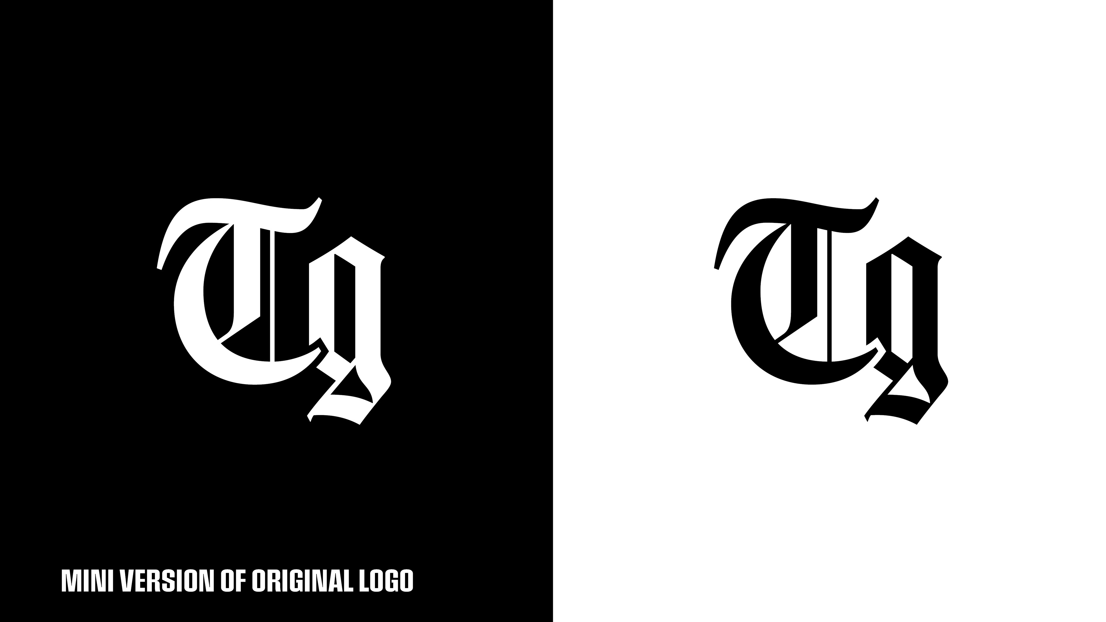
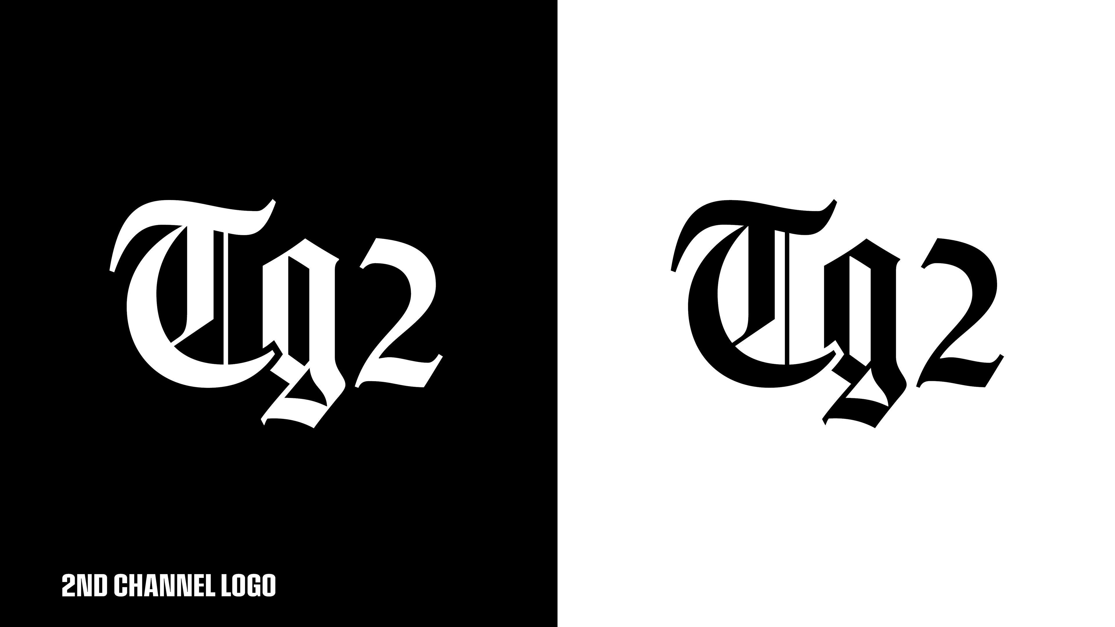
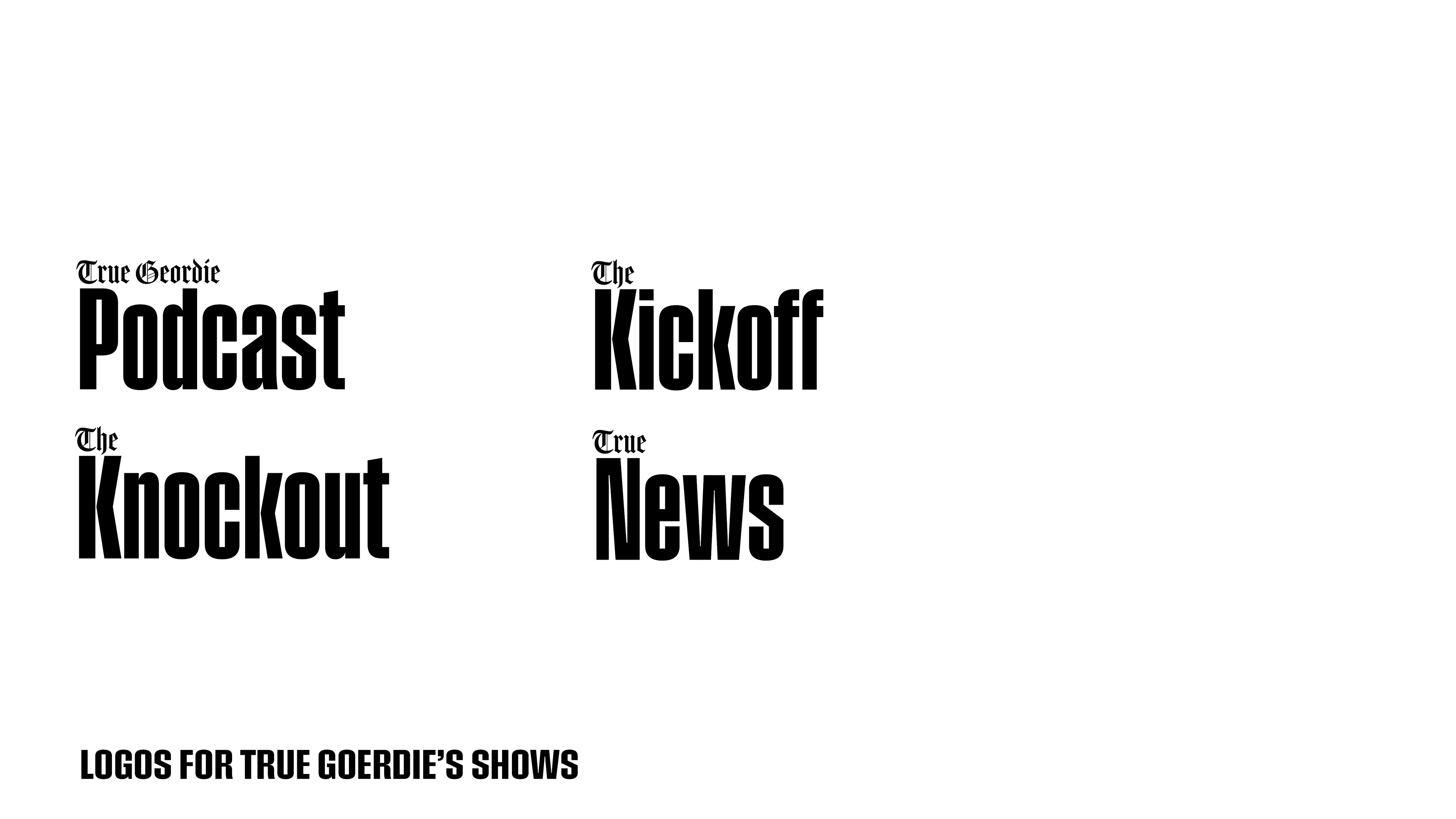
True Geordie is a channel on Youtube. It started with Brian (Geordie) alone, and then a lot of people joined him over time. At the moment, Geordie, his friend Lozcast, and a whole team make 4 shows on the channel. The True Geordie Podcast, True News, The Kickoff, and The Knockout. They even have 3 channels now. True Geordie, TG2, The Kickoff.
About 2 months ago, Brian (True Geordie) posted that he needs a graphic designer, and told people who wanna work with him to make samples for his channel, like making new logos or rebranding the whole thing. So I said why not? Working with him would be amazing right? He's such a cool guy and I'm a big fan of the channel. I gave myself a very limited time to send the E-mail as fast as I can and I tried doing my best.
What stuff I did think was wrong?
Thumbnails were consistent but over-photoshopped , the overall look of the channel had to be visually attached to the channel. And without being over-photoshopped, there was no certain color palette, the logos were cool but weren't consistent. They were all over the place. All the stuff felt like they were professional but all over the place. So things needed to be more consistent and needed to be simpler than that. And needed to be a bit closer to the persona of the channels and the audience.
So that's what I did to fix
what was wrong:
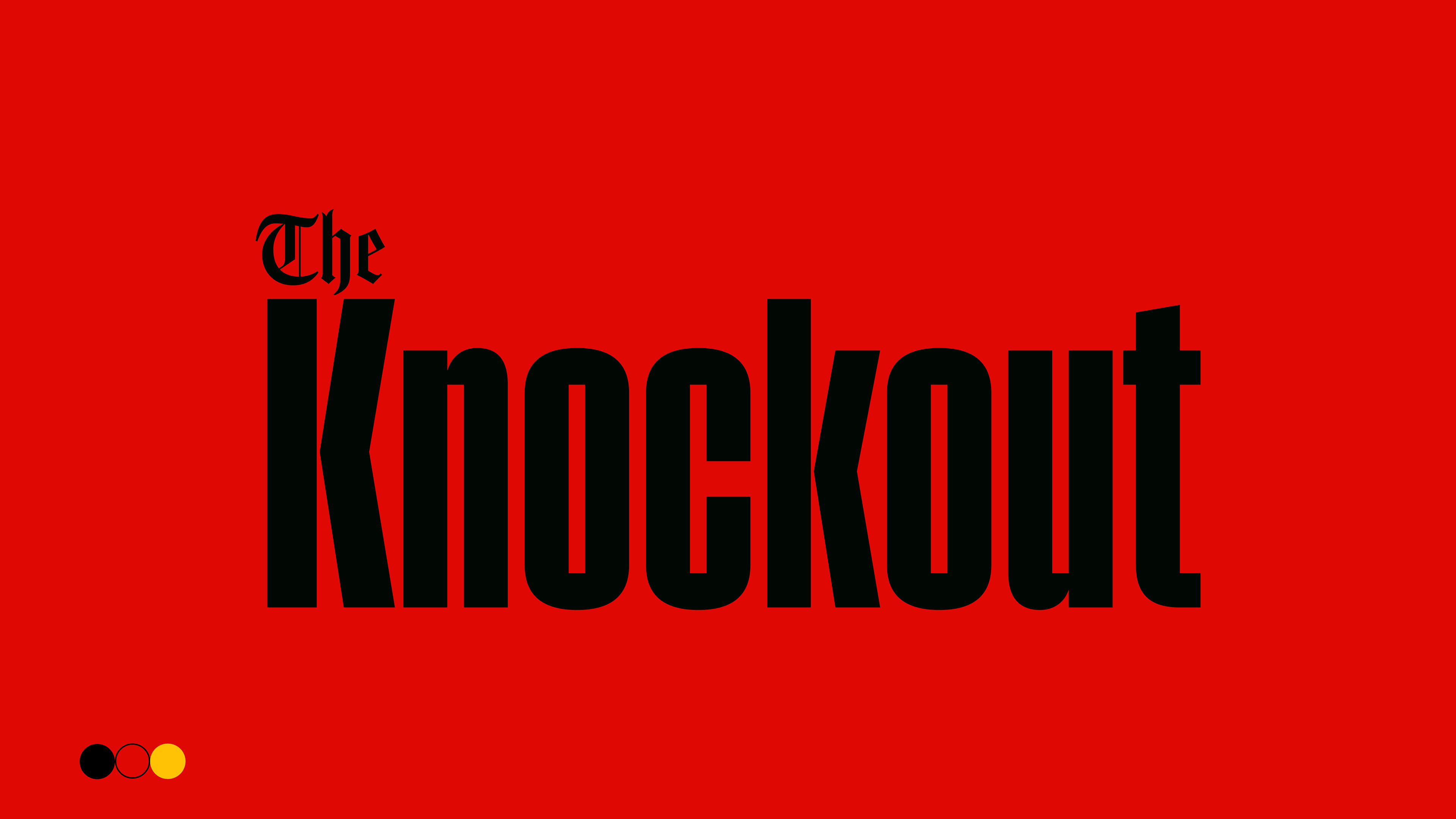
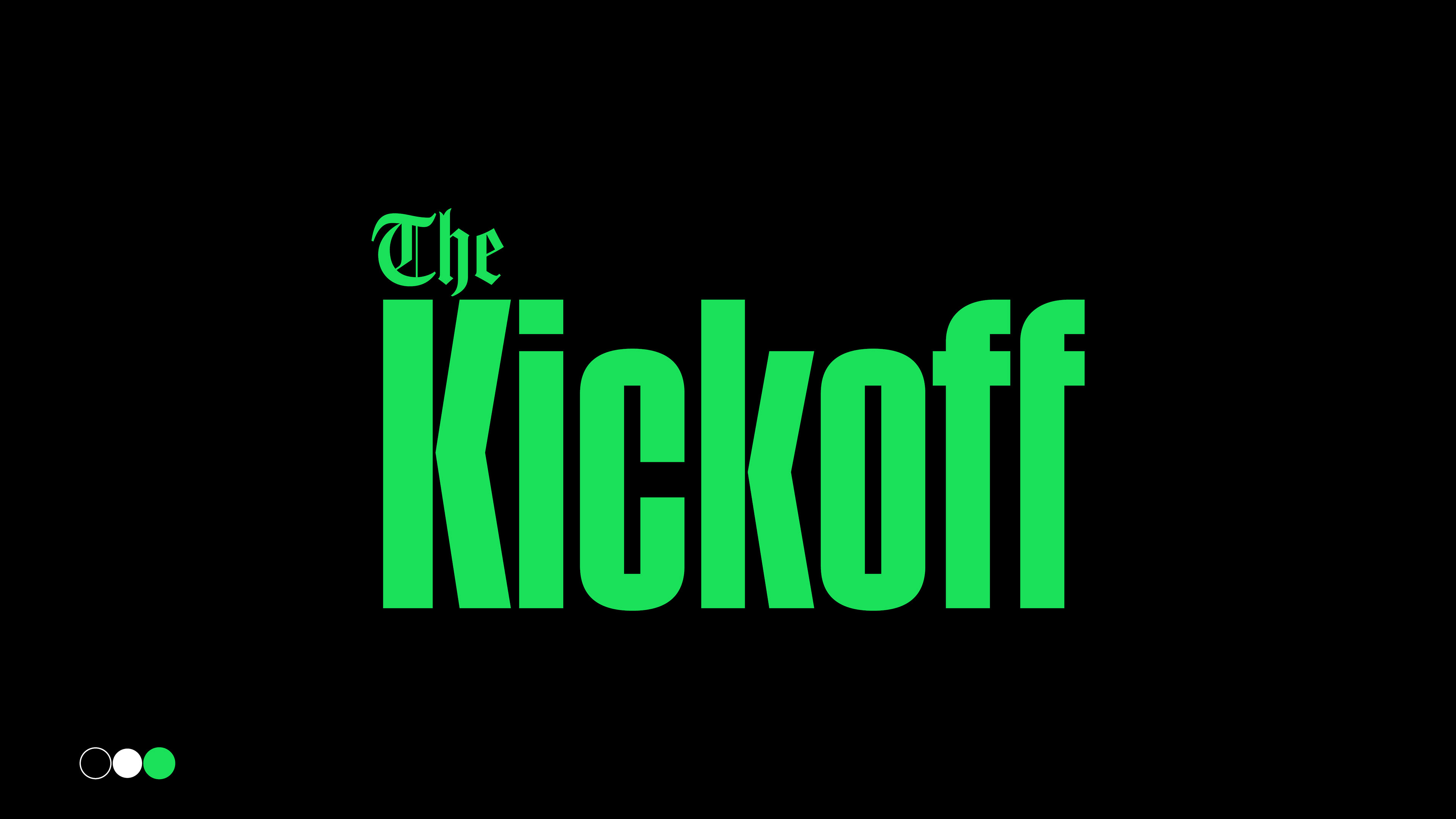
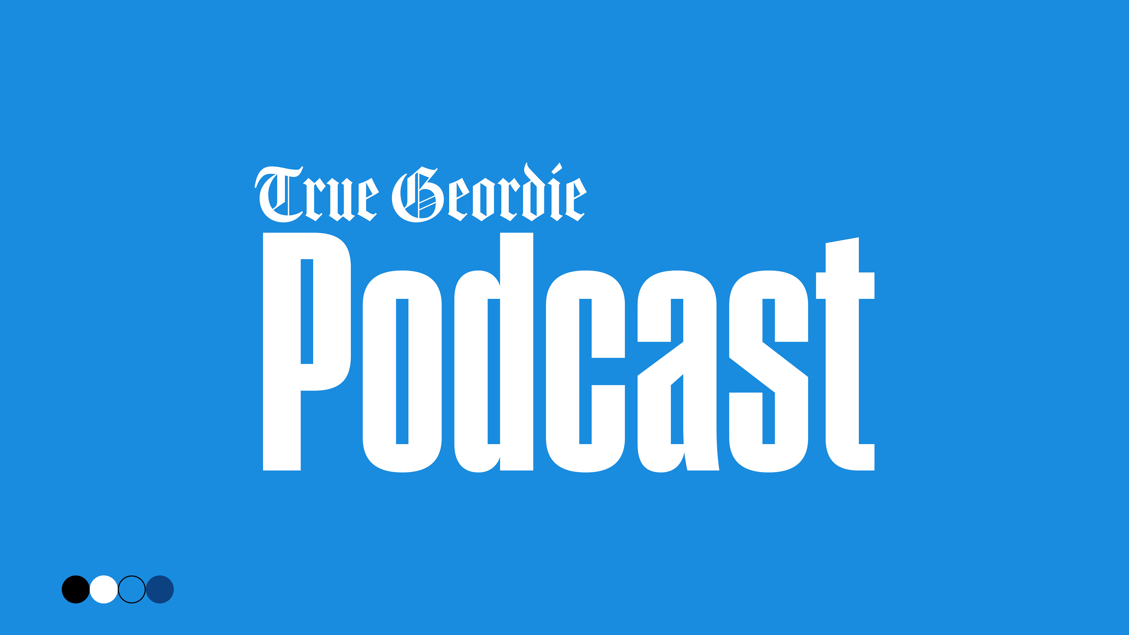
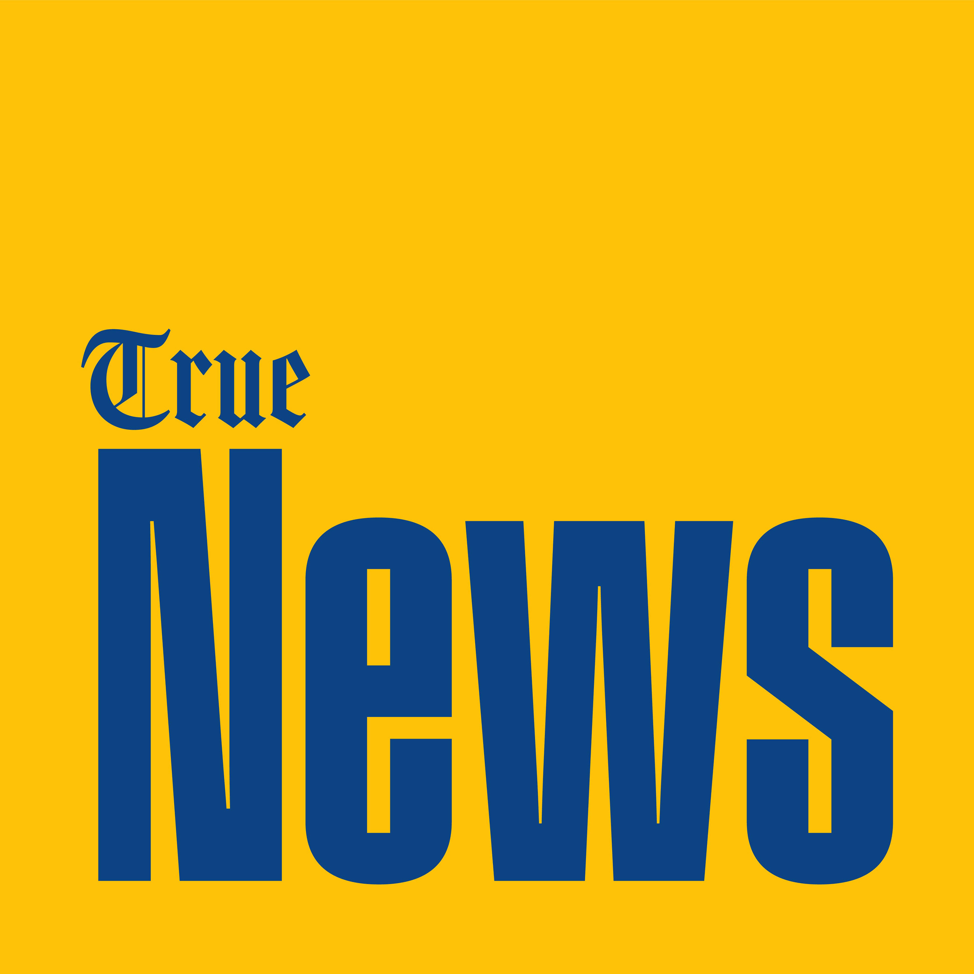
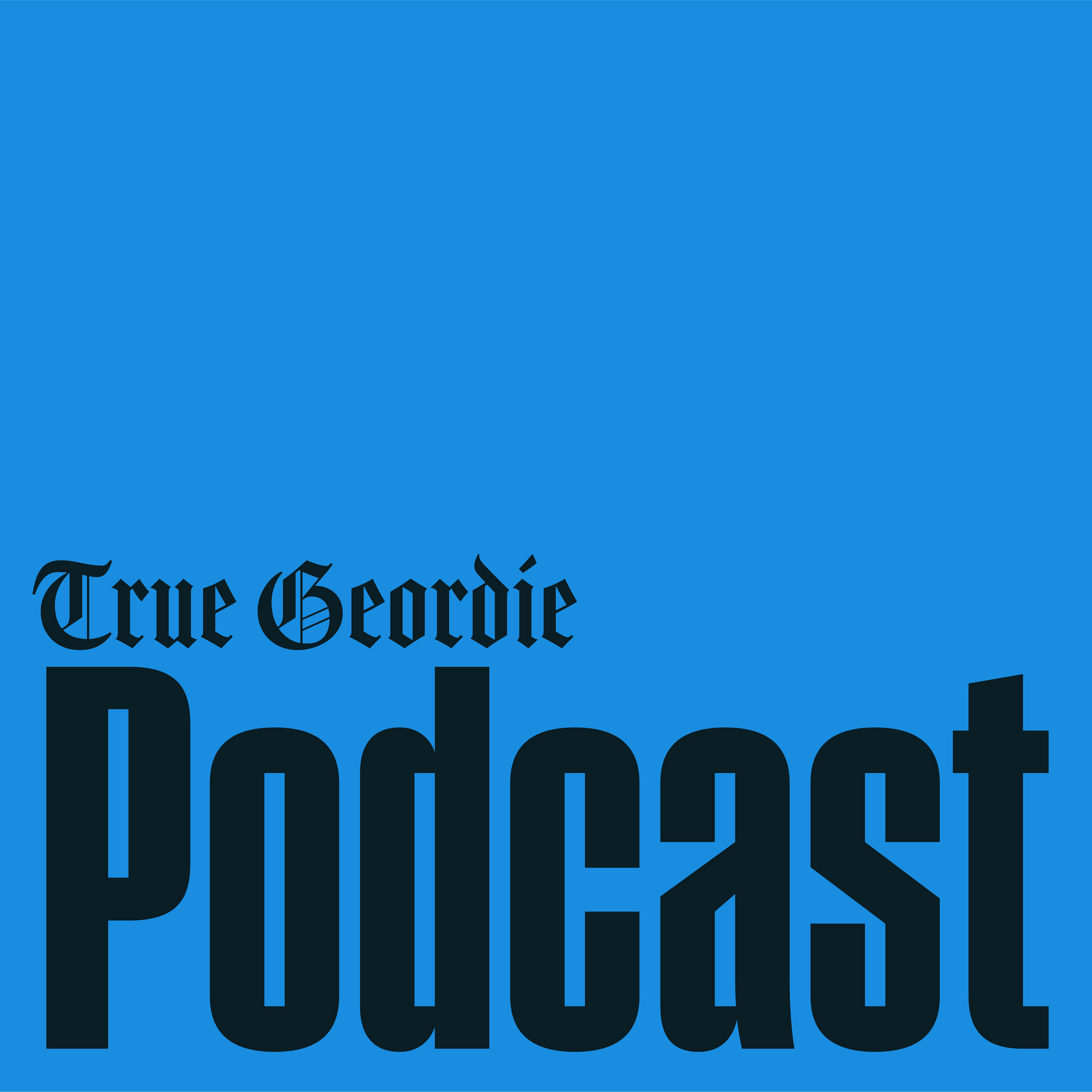
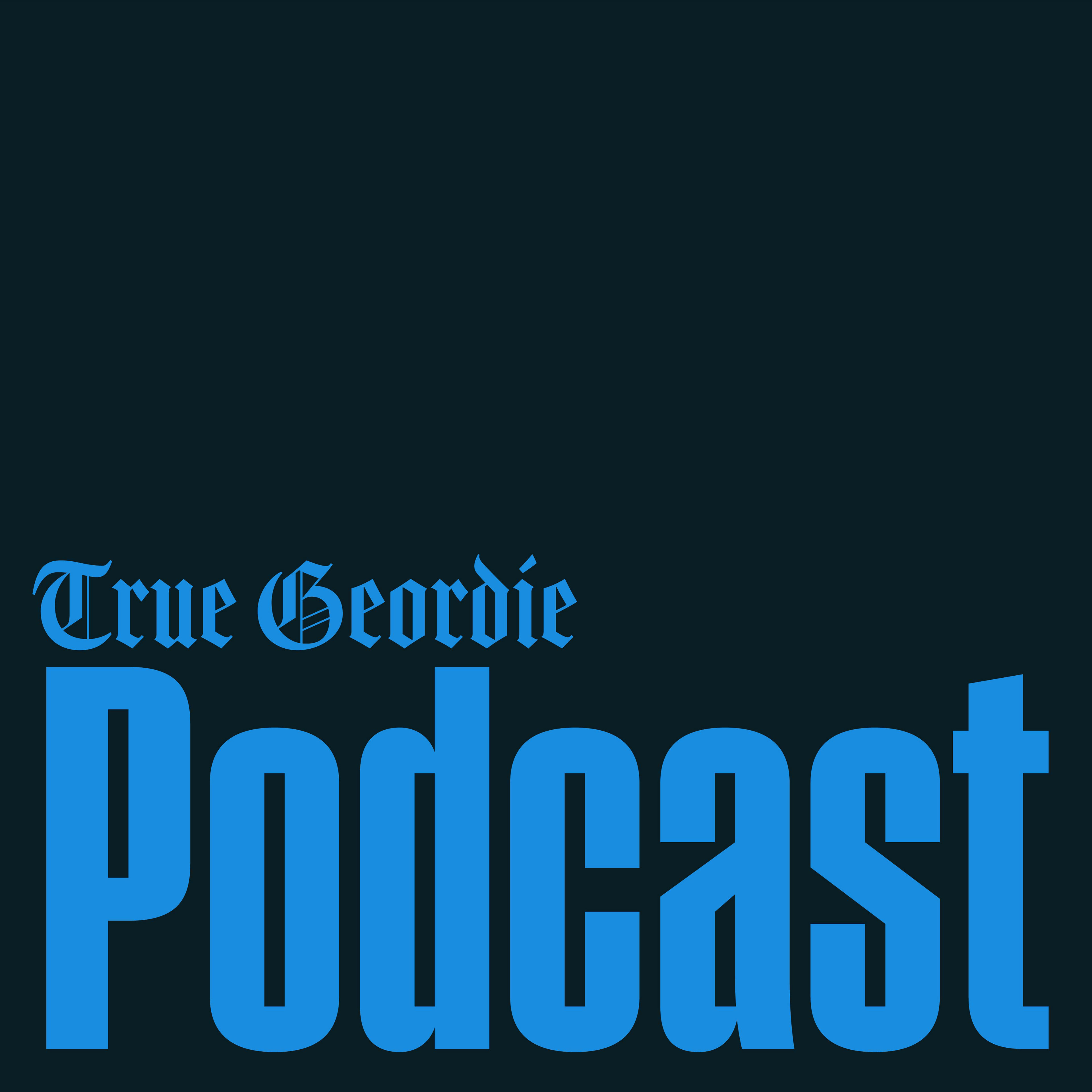
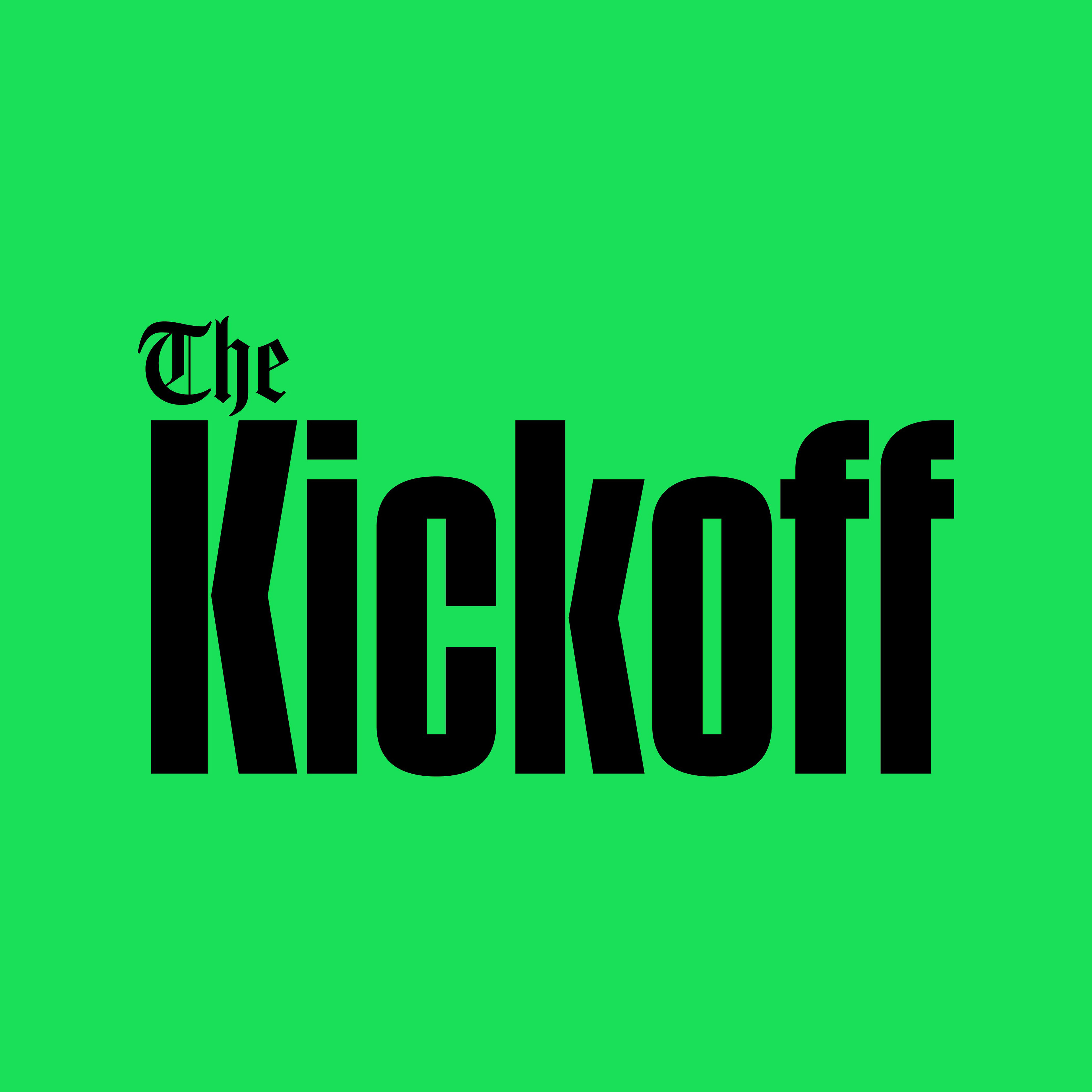
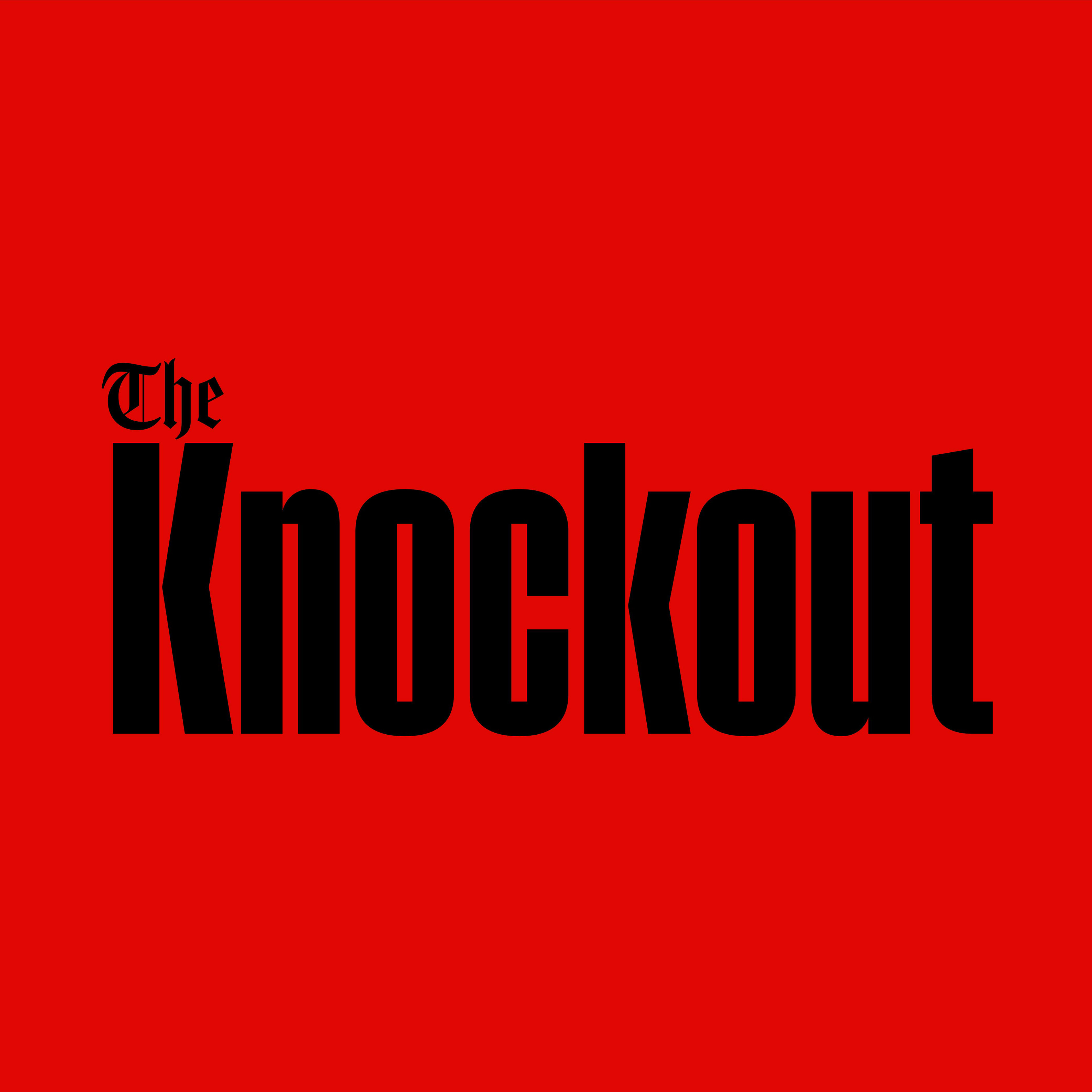
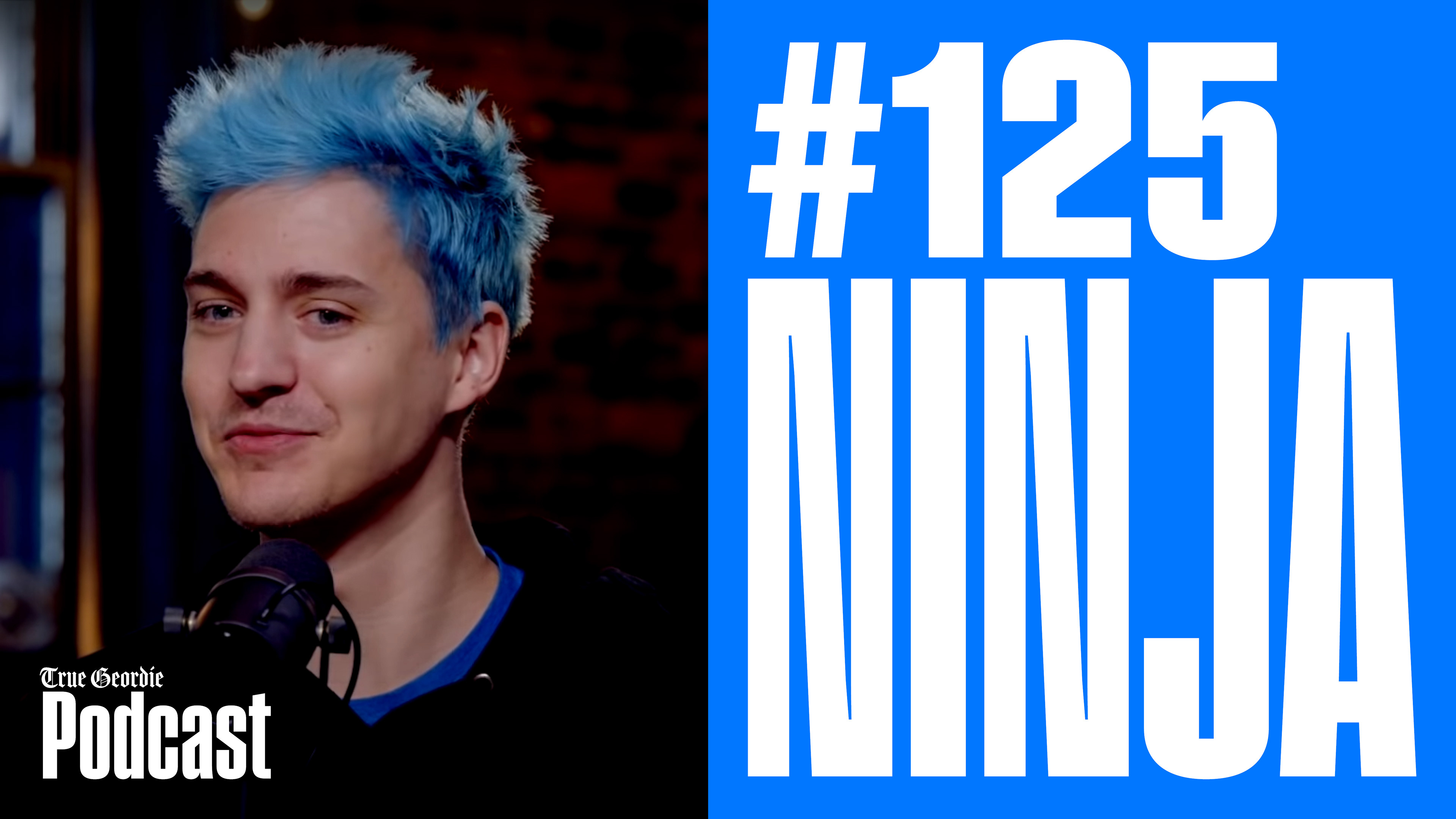
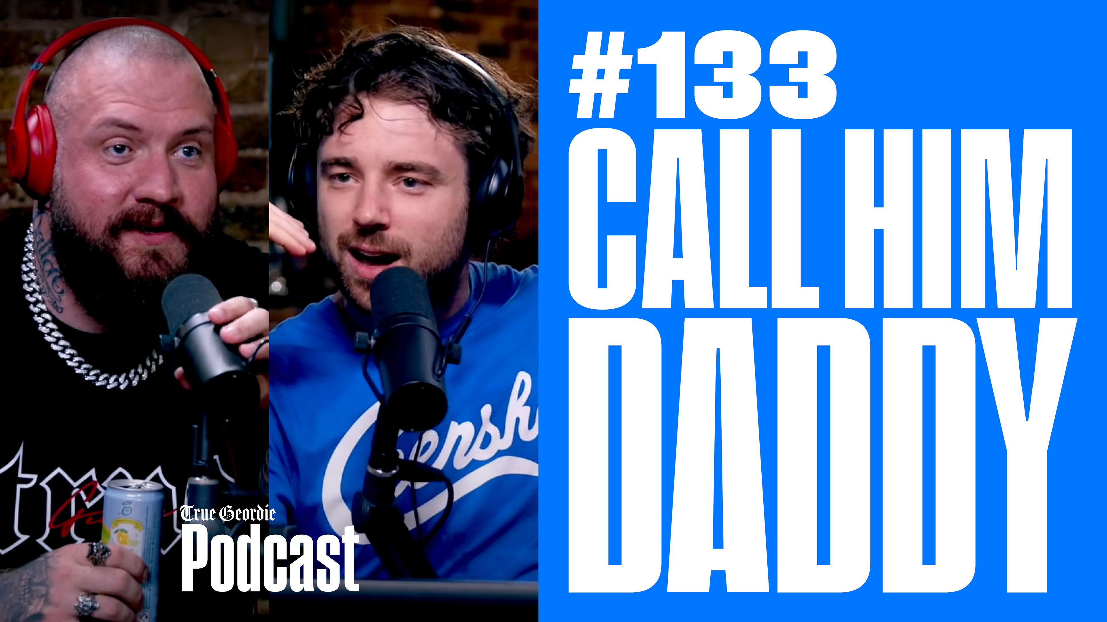
New logos!
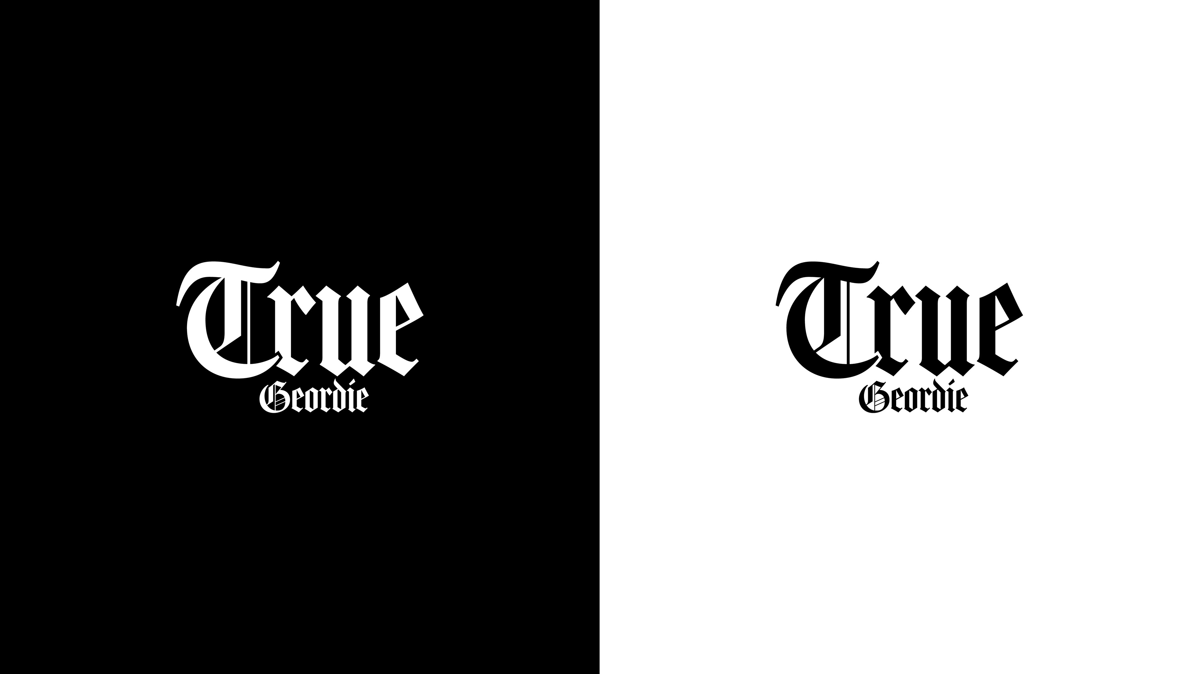
I refreshed the old logos and made new ones. The old original True Geordie logo was also a blackletter/gothic style so I tried a new well-balanced font called Amador from Adobe Fonts and it worked out perfectly!


New 4 logos for the 4 shows! And new color palettes
for every show.
Because the logos needed to feel like they are 4 brothers that look similar to each other, I made them with he same dynamic/style with the same 2 fonts, I didn't put too much work on them here.
After searching, I found the perfect typeface for both logos and typography. and it's Pressio, It has a lot of versions. It's bold, It can be condensed, can be wide, works perfectly on the vibe that was meant to be achieved.


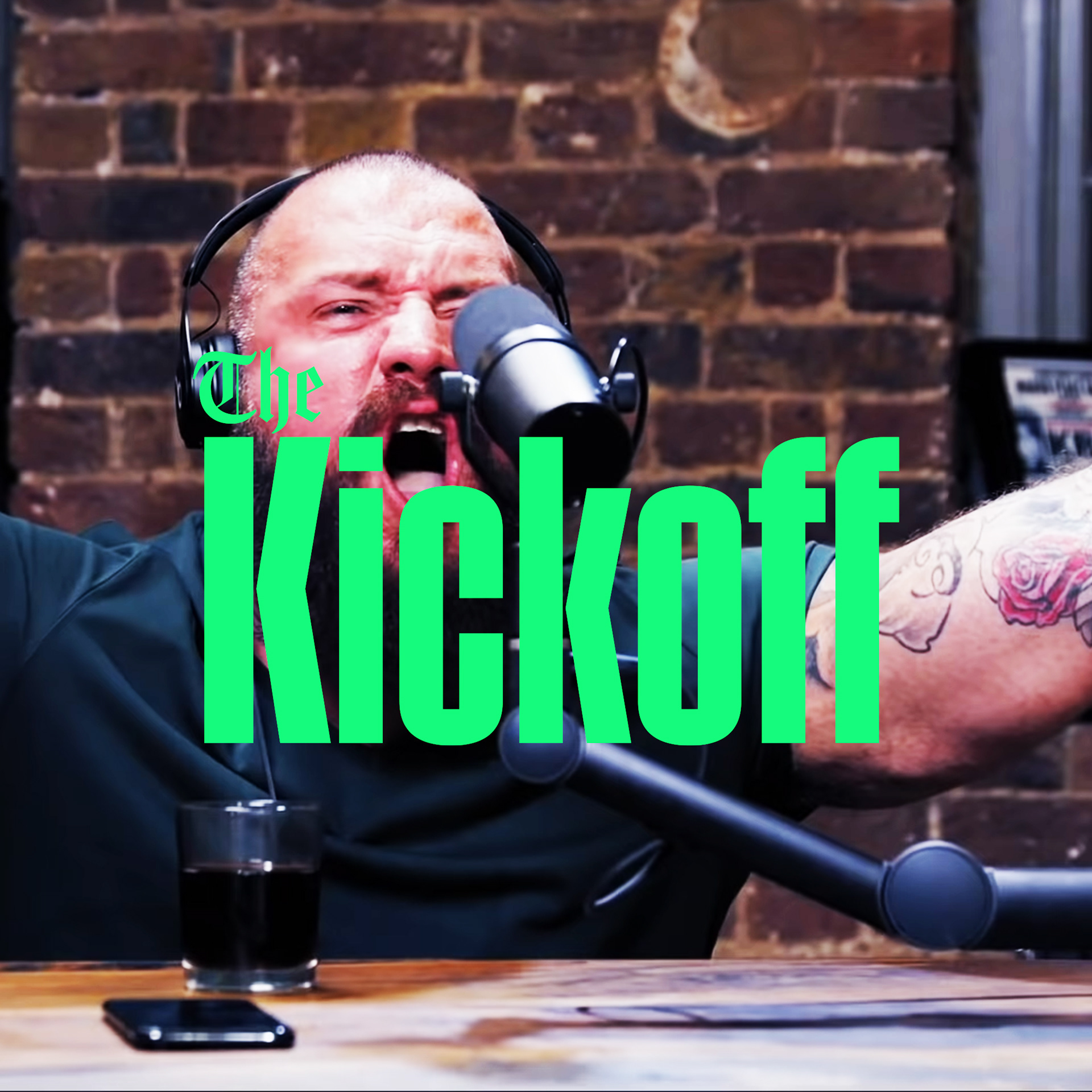
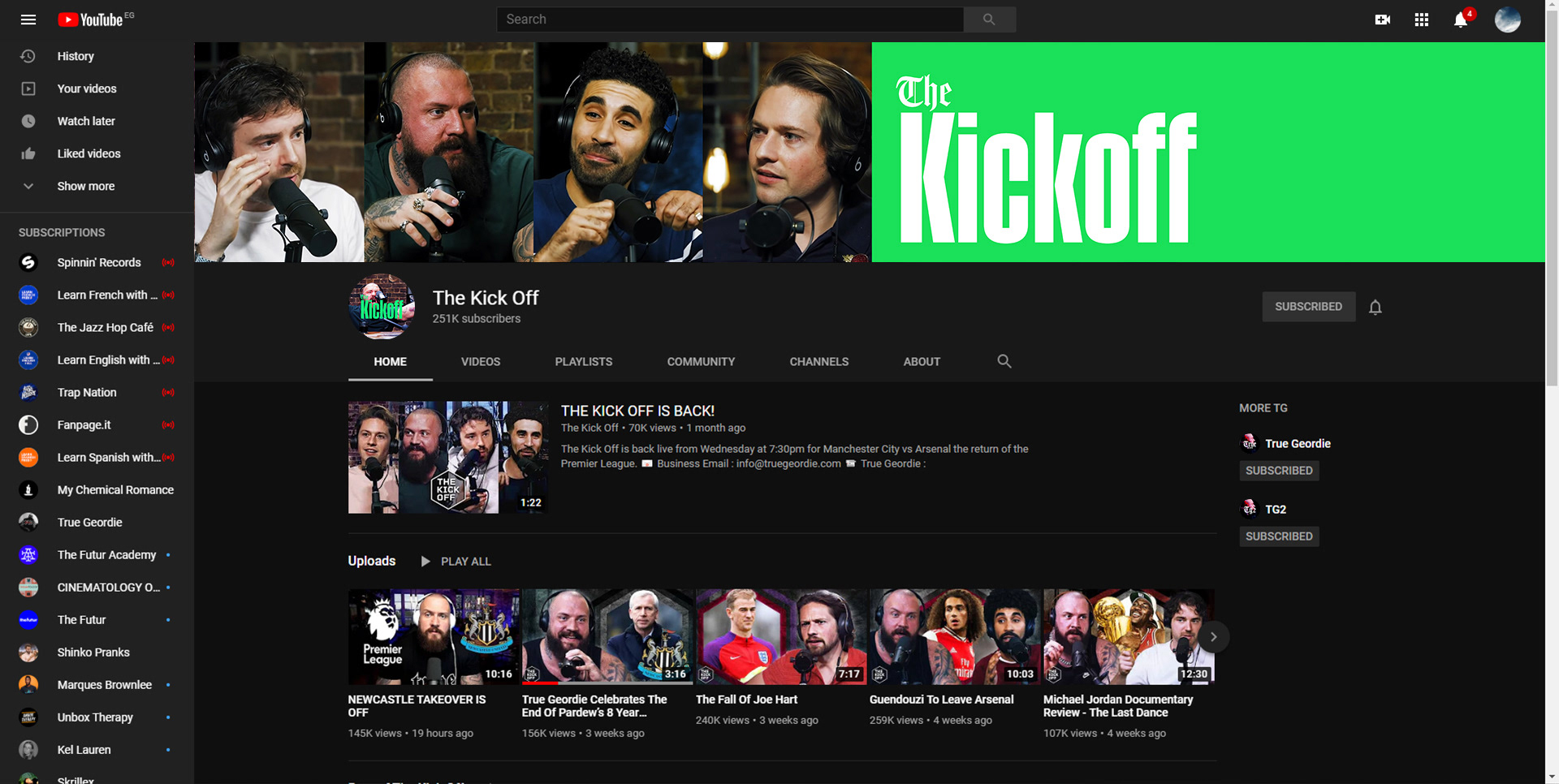
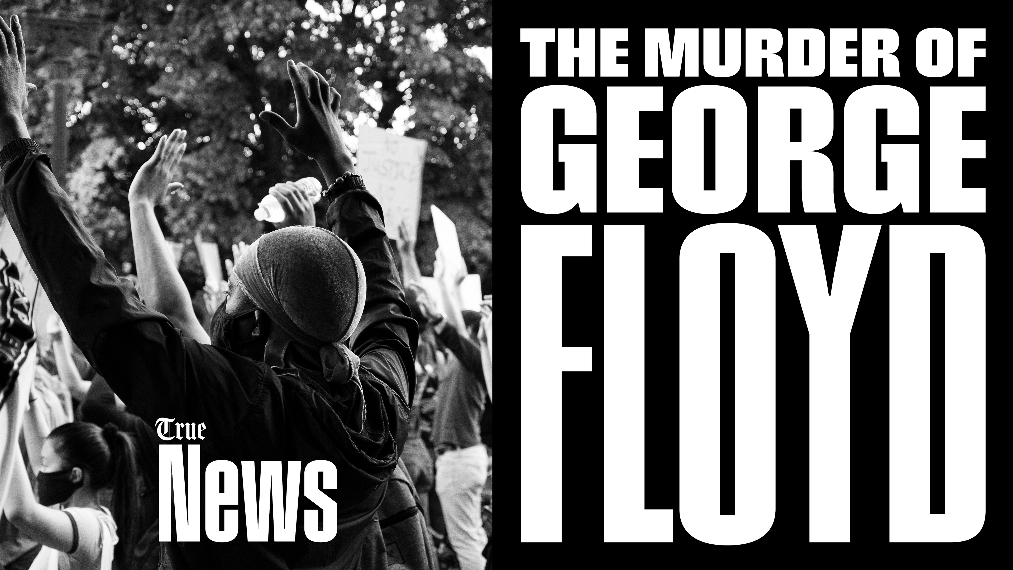
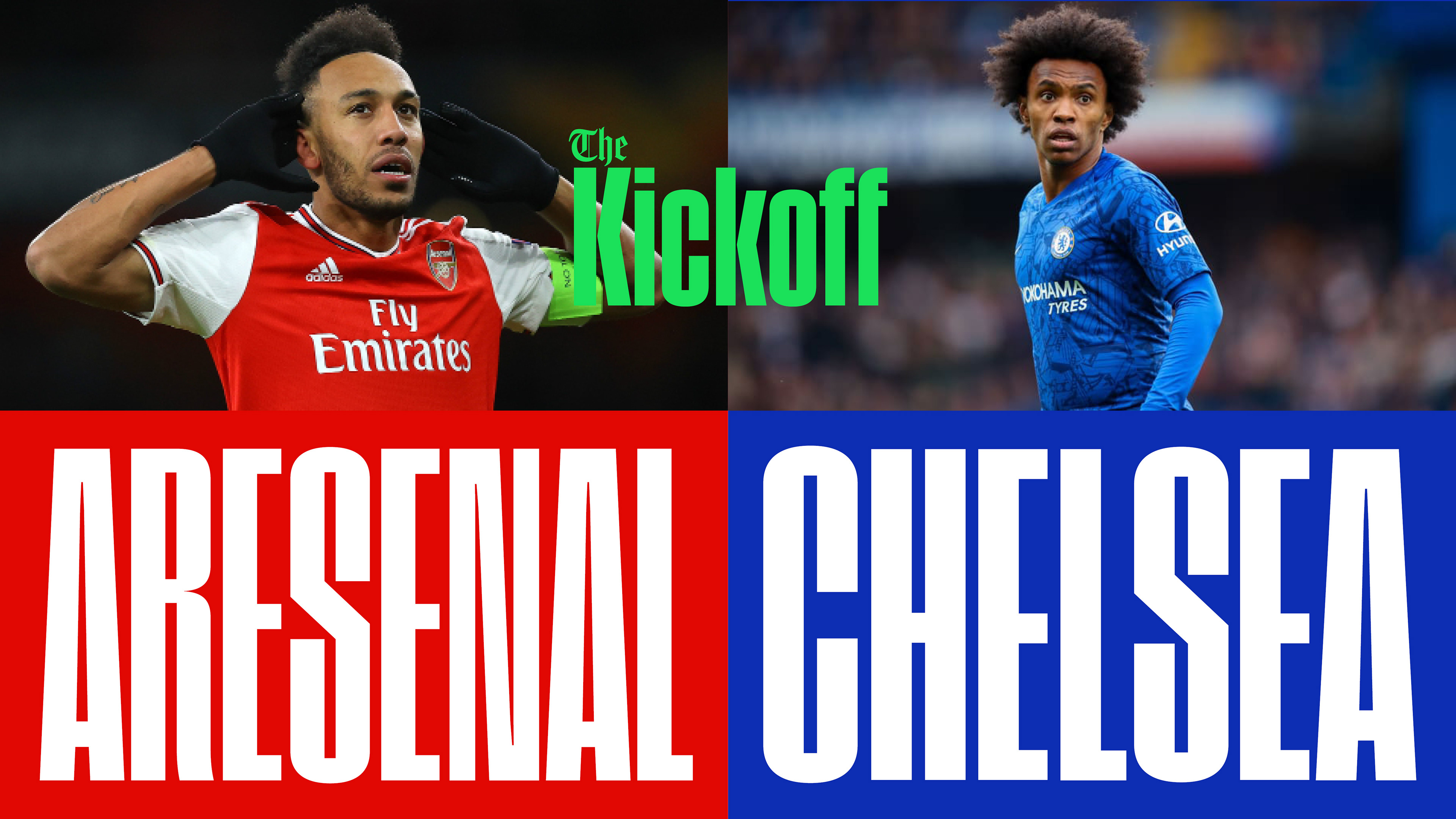
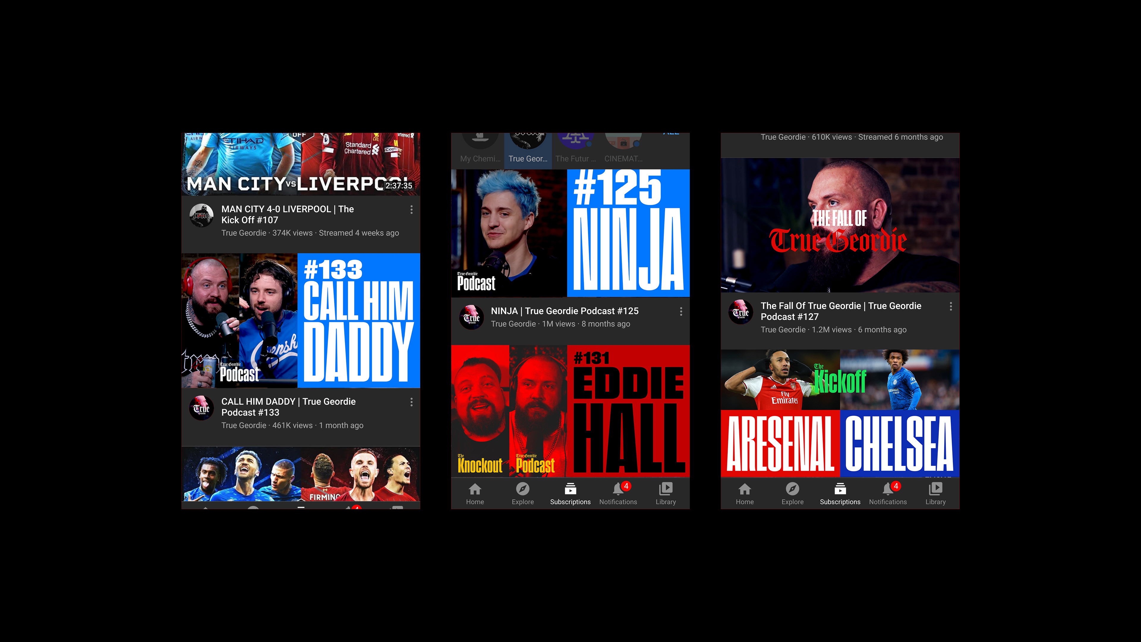
New thumbnail style!
I made a new thumbnail style that has this podcast-going live-media-ish vibe. With the Pressio typeface manually compressed so the typography fits a whole part of the thumbnail depending on the layout. And tried to make it attached to the feeling of the episode of the show itself by choosing the right pics and the right editing (duotone or normal photo improving).


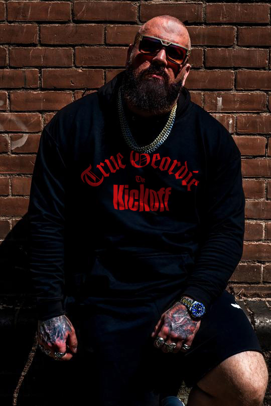
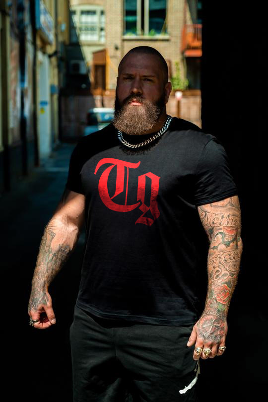
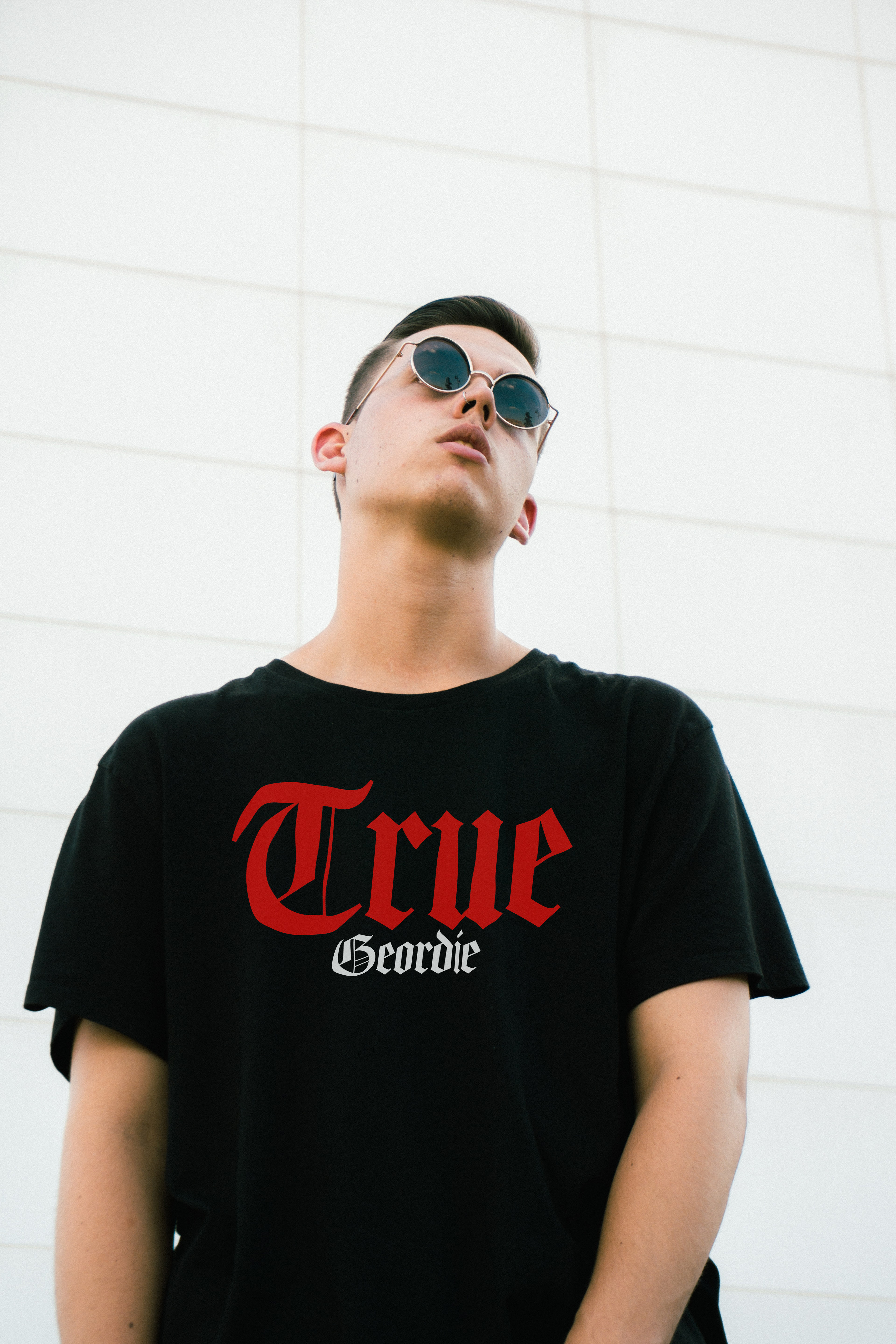
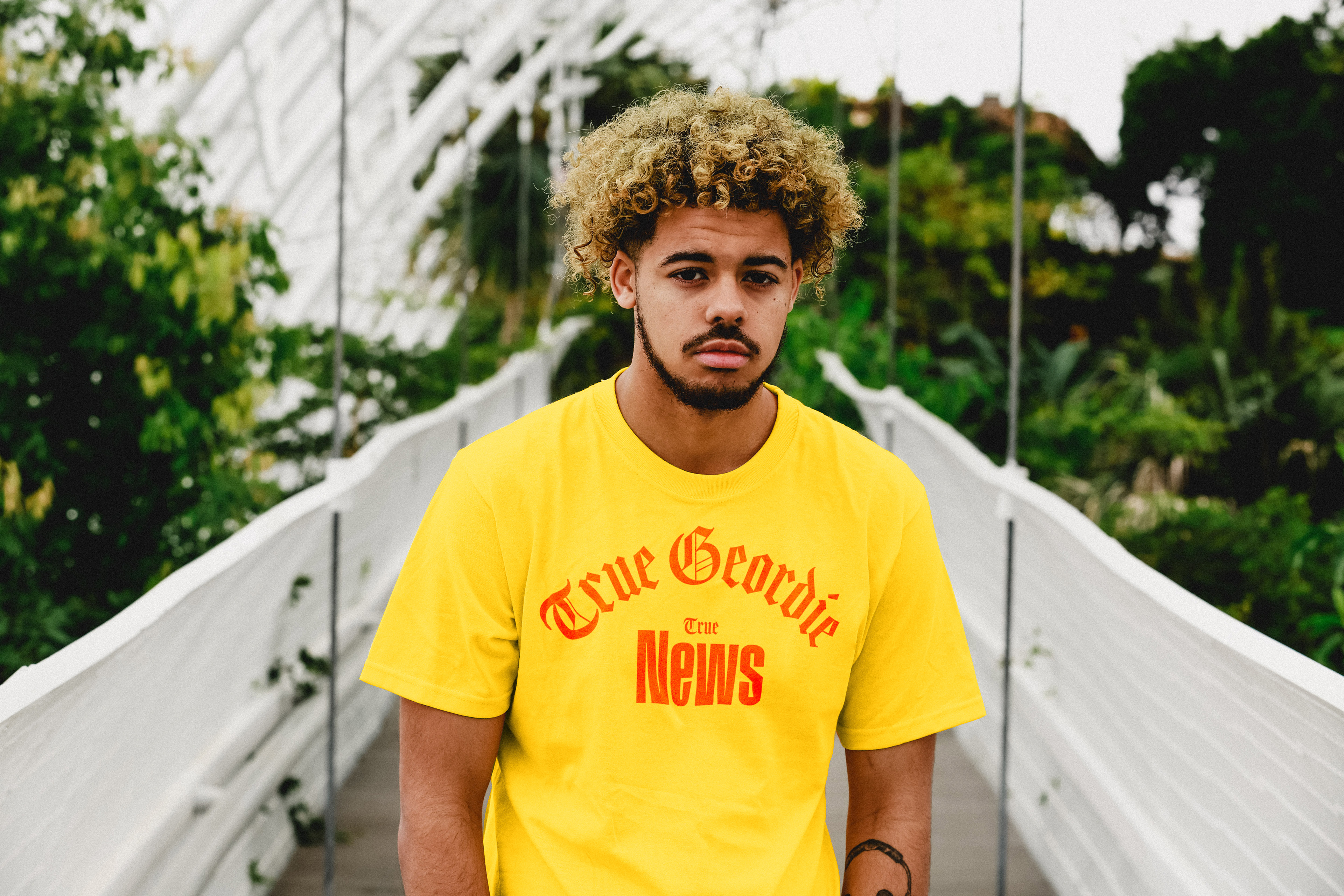
New Merch!
I made new merch design with variations you can choose from. And they turned out o be very adorable.